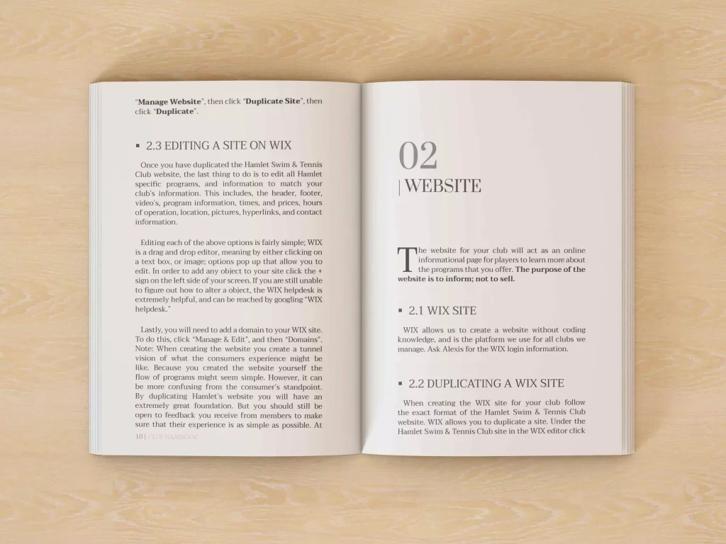
In the world of publishing, the allure of a well-designed book goes beyond just aesthetics. While captivating cover art may draw a reader in, it’s the consistent formatting throughout the pages that keeps them engaged. Consistent formatting isn’t just about making a book look good; it’s about enhancing the reading experience, establishing credibility, and conveying professionalism. In this post, we delve into the significance of consistent formatting in book design and why it should never be overlooked.

Enhancing Readability and Flow
Imagine picking up a book where each chapter starts with a different font, size, or spacing. It would be disorienting, to say the least. Consistent formatting ensures that readers can seamlessly navigate through the text without distractions. From font choice to line spacing, every element plays a role in enhancing readability and maintaining the flow of the narrative. Consistency in formatting allows readers to focus on the content rather than being bogged down by erratic design choices.

Establishing Brand Identity
For authors and publishers, consistent formatting serves as a visual representation of their brand identity. Just as a logo or color scheme communicates brand values in marketing materials, the formatting of a book reinforces the brand’s image. Whether it’s a sleek minimalist design or a classic serif font, consistent formatting helps readers recognize and connect with the brand across different titles. This consistency builds trust and loyalty among readers, who come to expect a certain level of quality from every book bearing the brand’s mark.

Creating a Professional Image
In the competitive world of publishing, professionalism is paramount. Consistent formatting signals to readers that a book has undergone thorough editing and design processes. It reflects a commitment to quality and attention to detail, which are essential for establishing credibility in the eyes of readers, reviewers, and industry professionals alike. A well-formatted book not only attracts readers but also opens doors to opportunities such as literary awards, media coverage, and partnerships with distributors.

Facilitating Accessibility
Consistent formatting isn’t just about aesthetics; it’s also about accessibility. For readers with visual impairments or reading disabilities, uniform design elements make it easier to navigate the text using assistive technologies. Clear typography, consistent spacing, and well-defined headings all contribute to a more accessible reading experience. By prioritizing consistency in formatting, authors and publishers can ensure that their books are accessible to a broader audience, including those with diverse needs.
Conclusion
In the world of book design, consistency is king. From enhancing readability and establishing brand identity to fostering professionalism and facilitating accessibility, consistent formatting plays a multifaceted role in shaping the reading experience. Authors and publishers who prioritize consistency demonstrate a commitment to quality and craftsmanship, earning the trust and loyalty of readers in the process. In an industry where first impressions matter, consistent formatting isn’t just a nicety—it’s a necessity.
